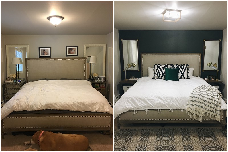
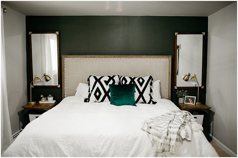
YIPEE!!! I am SO excited to finally share this FUN makeover I got to do for my husband Eric! He was gone on a trip and I wanted to do something to our master bedroom that would be 1.) Simple enough for me to accomplish in 7 days while he was away 2.) Was masculine enough for him, but trendy enough for my style and 3.) That I knew I would love for a long time!
This is where my friend Brooke at White Space Design Group (See them on Insta) comes into play! I am NOT a home decorator at all and when I try to put together items that I like, my ideas tend to come across more eclectic than I want them to be and I start hating my designs just a few months later…. SO when Brooke came on board, I shared a couple Pinterest photos with her of the inspiration I was looking at and then shared my own bedroom as it stood. Brooke created this design inspiration board for me and even provided links to the exact items or similar items in different price points!
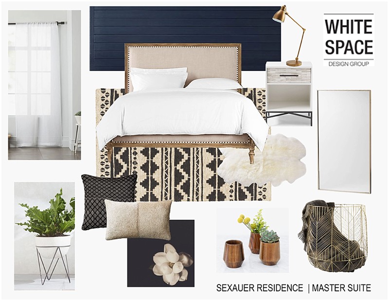
The one thing I knew, was that I didn’t want break the bank. SO I kept our original bed frame (that E and I both love! It’s form Restoration Hardware) and also found a few key pieces on sale! Plush Rugs was a MUST for me because they do have KILLER prices on so many rugs! I mean you can literally find anything on their site. I found a couple different rugs and Brooke helped me narrow it down. Originally, I had selected a larger bolder pattern, which brooke incorporated into the design board she made for me. After I got the busier rug in the room, I thought it looked a bit TOO busy since E is a designer and likes more simplistic designs, I decided to go with the less patterned of the two rugs and we LOVE IT! I will link everything at the bottom but here are some fun before and after photos! I can’t thank Brooke enough for helping me take my cluttered and chaotic vision to life! Hiring a professional to do the work you aren’t gifted in is SUCH a great idea friends. It’s a worthwhile investment!
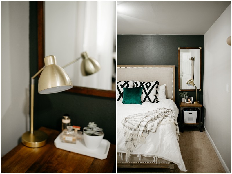
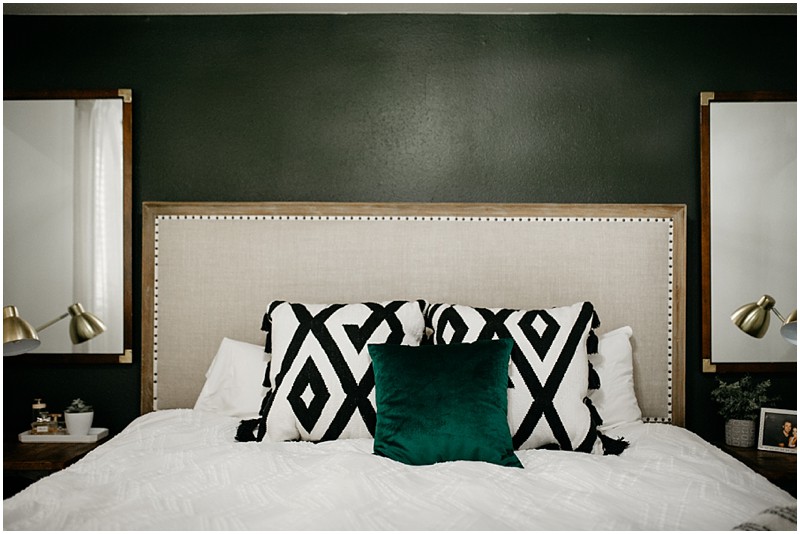
I feel like the darker green painted wall made the room actually feel larger and was probably Eric’s favorite part. Which I was super happy about since I worked so hard on painting it by myself HA!

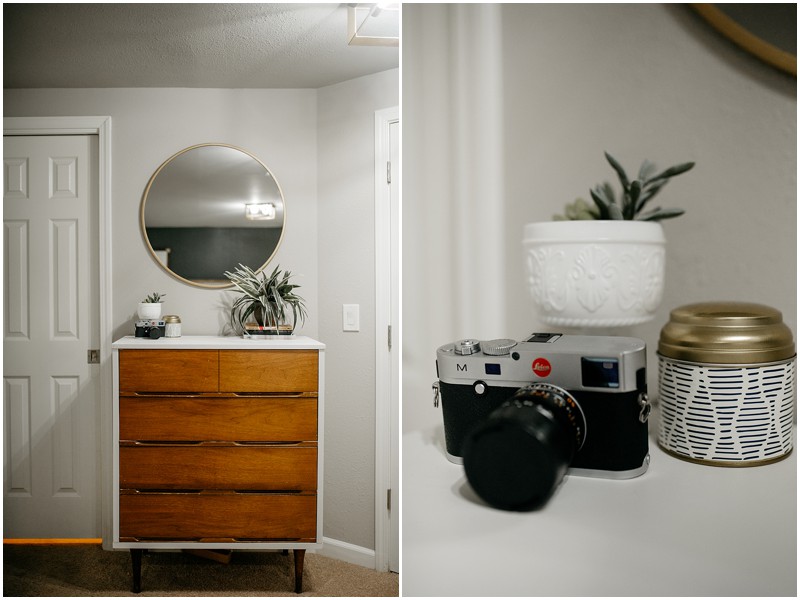
I found the dresser on the right for 40$ on Facebook Makerplace and simply painted the outside of it white to mimic one I had seen at West Elm.
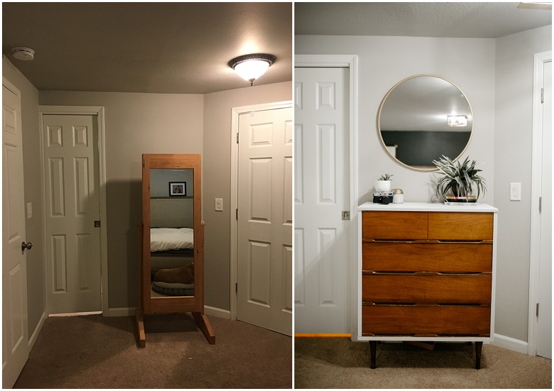
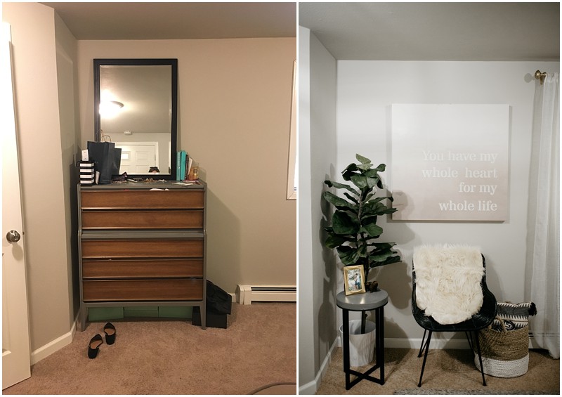
One of my favorite parts was actually switching out the light fixtures! When we bought our home, these awful decorative flush mount lights were through out it. I found these gorgeous gold square light fixtures at Home Depot just by searching “Gold Flush Mount” and there it was!
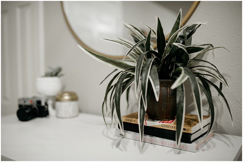
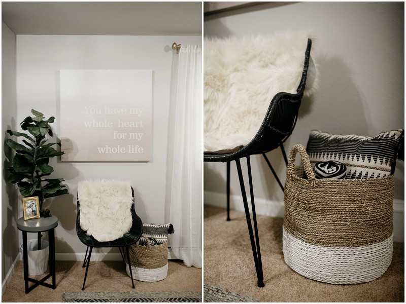
Here are a few more fun detail shots of the room. I hope you are inspired to know that YOU can do a makeover no matter WHAT your home looks like. No matter what, a few key changes can really make a difference!
Product Links:
[show_shopthepost_widget id=”2748181″]




Comments +